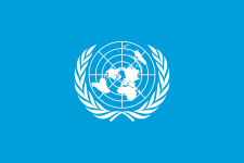
Flag of the UN
 |
|
| Proportion | 2:3 or 3:5 |
|---|---|
| Adopted | December 7, 1946 |
| Design | A white UN emblem (world map surrounded by two olive branches) on a blue background. |
| Designed by | Donal McLaughlin (emblem only) |
The flag of the United Nations was adopted on December 7, 1946, and consists of the official emblem of the United Nations in white on a blue background.
The emblem's design is described as:
A map of the world representing an azimuthal equidistant projection centred on the North Pole, inscribed in a wreath consisting of crossed conventionalized branches of the olive tree, . . . The projection of the map extends to 60 degrees south latitude, and includes five concentric circles.
The olive branches are a symbol for peace, and the world map represents all the people and the countries of the world.
White and blue are the official colours of the United Nations.
The organizers of the 1945 United Nations Conference on International Organization in San Francisco, California wanted an insignia that could be made into a pin to identify delegates. United States Secretary of State Edward Stettinius, Jr. was chairperson of the U.S. delegation, and realized that a temporary design might become the permanent symbol of the United Nations. He formed a committee headed by Oliver Lundquist that developed a design consisting of a world map surrounded by leaves from a design created by Donal McLaughlin.
The blue that appears in the background of the insignia was chosen to be "the opposite of red, the war colour", although the exact shade has never been officially specified by the United Nations. The original colour the group chose in 1945 was a gray blue that differs from the current United Nations flag. The globe used in the original design was an azimuthal projection focused on the North Pole with the United States, the host nation of the conference, at the centre. The projection that was used cut off portions of the Southern Hemisphere at the latitude of Argentina, which was acceptable at the time, as Argentina was not planned to be an original member of the United Nations. The projection was later altered so that no country will be at prominence within the flag. The new logo was now designed so that the globe is bisected in the centre by the Prime Meridian and the International Date Line.
...
Wikipedia
