Tahoma (typeface)
 |
|
| Category | Sans-serif |
|---|---|
| Classification | Humanist |
| Designer(s) | Matthew Carter |
| Foundry | Microsoft |
| Date released | 1994 |
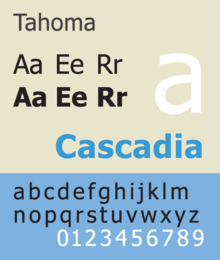
Tahoma is a humanist sans-serif typeface that Matthew Carter designed for Microsoft Corporation. Microsoft first distributed it, along with Carter's Verdana, as a standard font in the initial release of Windows 95.
While similar to Verdana, Tahoma has a narrower body, smaller counters, much tighter letter spacing, and a more complete Unicode character set. Carter first designed Tahoma as a bitmap font, then "carefully wrapped" TrueType outlines around those bitmaps. Carter based the bold weight on a double pixel width, rendering it closer to a heavy or black weight. In contrast with some other sans-serif typefaces, including Arial, the uppercase "I" (eye) is distinguishable from lowercase "l" (ell), which is especially important in technical publications. Since 2010, Ascender Corporation has offered italic and small caps versions of Tahoma.
Tahoma is often compared with Frutiger, another humanist sans-serif typeface. In an interview by Daniel Will-Harris, Carter acknowledged that Tahoma has some similarities with his earlier Bell Centennial typeface.
The Tahoma typeface family was named after the Native American name for the stratovolcano Mount Rainier (Mount Tahoma), which is a prominent feature of the southern landscape around the Seattle metropolitan area.
Tahoma was an official font supplied with Office 97, Office 2000, and Office XP, and was freely distributed with Word Viewer 97.
...
Wikipedia
