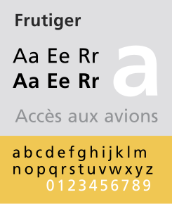
Frutiger (typeface)
 |
|
| Category | Humanist sans-serif |
|---|---|
| Designer(s) | Adrian Frutiger |
| Foundry | Linotype |
| Date released | 1975 |
| Variations | Frutiger Next |
Frutiger (pronounced with a hard g) is a series of typefaces named after its Swiss designer, Adrian Frutiger. Frutiger is a humanist sans-serif typeface, intended to be clear and highly legible at a distance or at small text sizes. A very popular design worldwide, type designer Steve Matteson described its structure as "the best choice for legibility in pretty much any situation" at small text sizes, while Erik Spiekermann named it as "the best general typeface ever".
Characteristics of this typeface are:
Frutiger is a sans-serif typeface by the Swiss type designer Adrian Frutiger. It is the text version of Frutiger's earlier typeface Roissy, commissioned in 1970/71 by the newly built Charles de Gaulle Airport at Roissy, France, which needed a new directional sign system, which itself was based on Concorde, a font Frutiger had created in the early 1960s.
The beginning of Frutiger starts from Concorde, a sans-serif font Frutiger was commissioned to design in 1961-4 by the minor metal type company Sofratype. Frutiger was asked to create a design that would not be too similar to his previous Univers, a reinvention of classic 19th-century typefaces. In practice the design detail was partly created by his colleague (and fellow Swiss in Paris) André Gürtler as Frutiger was busy. Frutiger wrote of it: "I felt I was on the right track with this grotesque; it was a truly novel typeface." Gürtler too wrote of feeling that the design was innovative: "this style didn't exist in grotesques at the time, except for Gill Sans." Despite Frutiger and Gürtler's enthusiasm, the design failed to sell well and was discontinued with the end of the metal type period: Frutiger wrote that Linotype, who bought Sofratype, "weren't aware of the fact that with Concorde they had a totally up-to-date typeface."
Some years later, Frutiger was commissioned to develop a typeface for Roissy Airport. Frutiger had earlier created an alphabet inspired by Univers and Peignot for Paris Orly Airport, but found the experience a failure due to lack of control and the insistence that all text be in capitals only. As a result, he proposed a modified version of Concorde, refining it following research into legibility. The Roissy typeface was completed in 1972. Impressed by the quality of the Roissy airport signage, the typographical director of the Mergenthaler Linotype Company approached Frutiger in 1974 to turn it into a typeface for print.
...
Wikipedia
