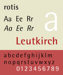
Rotis
 |
|
| Category | Font superfamily; humanist sans-serif |
|---|---|
| Designer(s) | Otl Aicher |
| Foundry | Agfa |
| Variations | Rotis serif Rotis semi-serif Rotis semi-sans rotis sans |
| Shown here | Rotis semi-sans |
Rotis is a typeface developed in 1988 by Otl Aicher, a German graphic designer and typographer. In Rotis, Aicher explores an attempt at maximum legibility through a highly unified yet varied typeface family that ranges from full serif, glyphic, and sans-serif. The four basic Rotis variants are:
When the Rotis fonts were reissued under the Monotype Originals label, the fonts support include support of ISO Adobe 2 character set, OpenType features. The Rotis font names are capitalized.
It includes 55 Roman, 56 Italic, 65 Bold fonts.
It includes 45 Light, 46 Light Italic, 55 Roman, 56 Italic, 65 Bold, 75 Extra Bold fonts.
It includes support of ISO Adobe 2, Adobe CE, Latin Extended characters. In addition, separate fonts for Greek and Cyrillic characters were also created. Greek and Cyrillic fonts support ISO Adobe 2 and Latin Extended characters, and support super/sub-script OpenType feature.
It is a version of Rotis Sans designed by Monotype Imaging senior designer Robin Nicholas, and freelance designer Alice Savoie. It expands the original with extra 3 font weights (Light, Semi Bold, and Black) and italics, along with revised letter spacing and kerning, a new set of numerals with similar height to the capitals.
The family includes 14 fonts in 7 weights, with complimentary italics. OpenType features include access all alternates, case-sensitive forms, numerators/denominators, fractions, standard ligatures, localized forms (OpenType Pro fonts only), proportional/tabular figures, scientific inferiors, superscript/subscript, stylistic alternates, stylistic sets 1 and 2 and 3 (OpenType Std fonts only). It supports ISO Adobe 2, Adobe CE, Latin Extended characters (OpenType Pro fonts only).
The typeface is named after Rotis, a hamlet belonging to the German town of Leutkirch im Allgäu, where Otl Aicher lived. However, Aicher named the font "rotis", in minuscules, since Aicher thought of capital letters as a sign of hierarchy and oppression.
When the fonts were reissued by Monotype Imaging in 2011, though, the font names were capitalized to "Rotis". This also affected fonts published by downstream foundries.
Not all review of Rotis have been favourable. Prominent typeface designer Erik Spiekermann commented that "Rotis is not a typeface. It has some great letters, but they never come together to make words that don't look contrived or uncomfortable. It looks best on gravestones and similar large architectural applications." He has also joked that he wants the design on his gravestone.
...
Wikipedia
