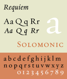
Requiem Text
 |
|
| Category | Serif |
|---|---|
| Classification | Old-style |
| Designer(s) | Jonathan Hoefler |
| Foundry | Hoefler & Frere-Jones |
Requiem is an old-style serif typeface designed by Jonathan Hoefler in 1992 for Travel & Leisure magazine and sold by his company, Hoefler & Frere-Jones. The typeface takes inspiration from a set of inscriptional capitals found in Ludovico Vicentino degli Arrighi's 1523 writing manual, Il Modo de Temperare le Penne, and its italics are based on the chancery calligraphy, or cancelleresca corsiva of the period.
Like many other typefaces designed by Hoefler & Frere-Jones, the family is large, intended for professional use. It is designed with three separate optical sizes of font, intended for different sizes of text, as well as two different styles of capitals inside cartouches intended for title pages and frontispieces. It also contains fleurons and italic ligatures inspired by calligraphy, as well as stylistic alternates such as an alternative 'Y' character. Like typefaces of the period, it does not contain a bold style, as these were only invented in the nineteenth century.
Three optical sizes, with regular (or roman) and italic styles for each:
There are no small caps in the italic styles.
Some releases of Requiem may also contain small caps, italic ligature and fleuron characters as separate fonts.
Hoefler Text - old-style serif design, also by Jonathan Hoefler, with bold styles, swashes and a wider range of arabesque designs; also matching titling face Hoefler Titling.
...
Wikipedia
