London Transport (brand)
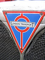
 Logo as used on bus radiator grilles |
|
| Product type | Public transport |
|---|---|
| Owner | Transport for London |
| Country |
|
| Introduced | 1933 |
| Discontinued | 2000 |
| Related brands | London Underground |
| Markets | Greater London |
| Previous owners | 1933 - LPTB 1948 - LTE 1963 - LTB 1970 - LTE (GLC) 1984 - LRT |
| Registered as a trademark in | United Kingdom (29 August 1934) |
London Transport (LT) was the public name and brand used by a series of public transport authorities in London, England, from 1933. Its most recognisable feature was the bar-and-circle 'roundel' logo. With its origins in the Underground Electric Railways Company of London (UERL), the brand was first used by the London Passenger Transport Board (LPTB) to unify the identity of the previously separately owned and managed London Underground, Metropolitan Railway, bus and tram services. The London Transport brand was extended under the direction of Frank Pick to all aspects of transport operation including poster designs, tickets, train livery, seat upholstery and the station architecture of Charles Holden. When public transport operation was taken over by Transport for London (TFL) from London Regional Transport (LRT) in 2000, the London Transport brand was discontinued and replaced with Transport for London's own branding, which incorporates many features of the London Transport brand including the 'roundel' symbol and the Johnston font.
Many aspects of the London Transport brand had their origins in the UERL. The bar-and-circle 'roundel' logo was first devised in 1908 and was used as part of the name boards at stations. The distinctive design, of a solid red circle and blue bar, enabled the station name to be easily identified. Also in 1908 a consistent logotype was devised, which would later be adopted by LPTB. From the 1910s, the logotype and roundel started to be used together. The roundel was adapted in 1912, influenced by the logo of the London General Omnibus Company. The solid red circle was replaced with a disc and was registered as a trademark. In 1913 Edward Johnston was commissioned to design a new common typeface. The dimensions of the roundel were standardised by the 1920s. Architect Charles Holden incorporated the roundel design into much of the station architecture of the 1920s and early 1930s. The use of modern graphic posters to advertise public transport began in this period is a ratio.
...
Wikipedia
