Georgia (typeface)
 |
|
| Category | Serif |
|---|---|
| Classification |
Scotch Roman, Transitional, Didone PANOSE: 2263545234 |
| Designer(s) | Matthew Carter |
| Foundry | Microsoft Corporation |
| Date created | 1993 |
| Date released | 1996 |
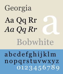
Georgia is a serif typeface designed in 1993 by Matthew Carter and hinted by Tom Rickner for the Microsoft Corporation. It was intended as a serif font that would appear elegant but legible printed small or on low-resolution screens. The font is inspired by Scotch Roman designs of the 19th century and was based on designs for a print typeface in the same style Carter was working on when contacted by Microsoft; this would be released under the name Miller some years later. The typeface's name referred to a tabloid headline claiming "Alien heads found in Georgia."
As a transitional serif design, Georgia shows a number of traditional features of 'rational' serif typefaces from around the early 19th century, such as alternating thick and thin strokes, ball terminals, a vertical axis and an italic taking inspiration from calligraphy. Its figure (numeral) designs are lower-case or text figures, designed to blend into continuous text; this was at the time a rare feature in computer fonts.
Closer inspection, however, shows how Georgia was designed for clarity on a computer monitor even at small sizes: it features a large x-height (tall lower-case letters) and its thin strokes are thicker than would be common on a typeface designed for display use or the higher resolution of print. Its reduced contrast and thickened serifs make it somewhat resemble Clarendon designs from the 19th century. Speaking in 2013 about the development of Georgia and Miller, Carter said, "I was familiar with Scotch romans, puzzled by the fact that they were once so popular...and then they disappeared completely."
Georgia's bold is also unusually bold, almost black. Carter noted that, "Verdana and Georgia...were all about binary bitmaps: every pixel was on or off, black or white...The bold versions of Verdana and Georgia are bolder than most bolds, because on the screen, at the time we were doing this in the mid-1990s, if the stem wanted to be thicker than one pixel, it could only go to two pixels. That is a bigger jump in weight than is conventional in print series." Given these unusual design decisions, Matthew Butterick, an expert on document design, recommended that organizations using Georgia for onscreen display license Miller to achieve a complementary, more balanced reading experience on paper.
...
Wikipedia
