Clarendon (typeface)
 |
|
| Category | Serif |
|---|---|
| Classification | Slab serif |
| Designer(s) | Robert Besley |
| Foundry | (Show all characters) |
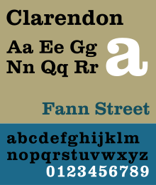
Clarendon is a slab-serif typeface that was created by Robert Besley for Thorowgood and Co. (or Thorowgood and Besley) of London, a letter foundry often known as the Fann Street Foundry. It was apparently named after the Clarendon Press in Oxford.
The typeface was published in 1845 after Besley, an employee of the foundry since 1826, was made a partner in the firm. Due to its popularity, Besley registered the typeface under Britain's Ornamental Designs Act of 1842. The patent expired three years later, and other foundries were quick to copy it. Besley was nonetheless successful in business, and became the Lord Mayor of London in 1869. Clarendon is considered the first registered typeface.
Clarendon types proved extremely popular in many parts of the world, in particular for display applications such as posters printed with wood type. They are therefore commonly associated with wanted posters of the American Old West.
The original Clarendon became the property of Stephenson Blake in 1906, who marketed a release named Consort, cutting some additional weights (a bold and italics) in the 1950s. The original matrices and punches were transferred to the Type Museum collection when Stephenson Blake left the printing business in 1996.
Designs for wood type were made from the mid-1840s on. The typeface was reworked by Monotype in 1935. Hermann Eidenbenz and Edouard Hoffmann cut a version, based on Besley's original design, in 1953. Freeman Craw drew the Craw Clarendon family, a once popular American version, released by American Type Founders, in 1955, with light, bold and condensed variants.
A variety of Clarendon revivals have been made since the original design, often adapting the design to different widths and weights. The original Clarendon design did not feature an italic, and many early Clarendon designs, being intended for headings, have capitals only with no lower-case letters, leaving many options for individual adaptation. An italic is particularly important in any design intended to be used for body type, and so designs have variously attempted to create an italic or offered obliques instead, a less conventional option for serif typefaces in which the characters are simply slanted.Volta, sold as Fortune in the U.S., was a very modern view of Clarendon, designed by Konrad Friedrich Bauer and Walter Baum for the Bauer Type Foundry, also in 1955. It is also the first to feature an italic in the medium weight.
...
Wikipedia
