Chicago (typeface)
 |
|
| Category | Sans-serif |
|---|---|
| Designer(s) | Susan Kare (1984), Charles Bigelow & Kris Holmes (1991) |
| Foundry |
Apple Computer (1984), Bigelow & Holmes (1991) |
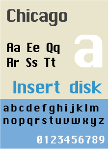
Chicago is a sans-serif typeface designed by Susan Kare for Apple Computer. It was used in the Macintosh operating system user interface between 1984 and 1997 and was an important part of Apple’s brand identity. It is also used in early versions of the iPod user interface. Chicago was initially a bitmap font; as the Apple OS’s capabilities improved, Apple commissioned the type foundry Bigelow & Holmes to create a vector-based TrueType version. The typeface is named after the U.S. city of Chicago, following the theme of original Macintosh fonts being named after major world cities.
Susan Kare has stated that Chicago was the first font to be developed for the Macintosh. Before the team settled on the convention of naming fonts after “world cities”, it was called Elefont (Elefont is also the name of a bold semi-serif typeface designed by Bob McGrath in 1978). The first bitmap version included only a 12 pt. version. This font, with only very minor changes to spacing, was used for menus, dialogs, window titles, and text labels, through version 7.6 of the system. The TrueType version had many differences from the bitmap version, which became more apparent at greater sizes. One of Chicago’s features was that it could remain legible while being made “grey” (to indicate a disabled menu item) by the removal of every other pixel (since actual grey type was not supported by the original Macintosh graphics hardware). The zero was slashed to distinguish it from capital “O”.
In Mac OS 8, Charcoal replaced Chicago as the default system font. Chicago continued to be distributed as a standard component of the system, and Apple even urged developers to keep designing user interfaces for the Chicago typeface, since the new alternate fonts used the Chicago metrics as a foundation.
...
Wikipedia
