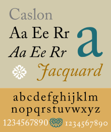
Caslon
 |
|
| Category | Serif |
|---|---|
| Classification | Old-style |
| Designer(s) | William Caslon I |
| Foundry | Caslon Type Foundry |
| Variations | many |
| Shown here | Adobe Caslon by Carol Twombly |
Caslon is the name given to serif typefaces designed by William Caslon I (c. 1692–1766) in London, or inspired by his work.
Caslon worked as an engraver of punches, the masters used to stamp the moulds or matrices used to cast metal type. He worked in the tradition of what is now called old-style serif letter design, that produced letters with a relatively organic structure resembling handwriting with a pen. Caslon established a tradition of engraving type in London, which previously had not been common, and so he was influenced by the imported Dutch Baroque typefaces that were popular in England at the time. His typefaces established a strong reputation for their quality and their attractive appearance, suitable for extended passages of text.
Caslon's fonts show an 'A' has a concave hollow at top left, the 'G' is without a downwards-pointing spur at bottom right and the sides of the 'M' are straight. The 'W' has three terminals at the top and the 'b' has a small tapered stroke ending at bottom left.Ascenders and descenders are short and the level of stroke contrast is modest in body text sizes. However, Caslon created subtly different designs of letter at different sizes, with increasing levels of fine detail and sharp contrast in stroke weight at larger sizes. In italic, Caslon's types have a varied angle of slant, with particularly sharp slanting on the A. The Q, v, w, and z all have flourishes or swashes in the original design, something not all revivals follow.
Caslon's typefaces were popular in his lifetime and beyond, and after a brief period of eclipse in the early nineteenth century remain very commonly used, particularly for setting printed body text and books. Many revivals exist, with varying faithfulness to Caslon's original design. Modern Caslon revivals also often add features such as a matching bold and 'lining' numbers at the height of capital letters, neither of which were used in Caslon's time. William Berkson, designer of a revival of Caslon, describes Caslon in body text as "comfortable and inviting".
...
Wikipedia
