Arrighi (typeface)
 |
|
| Category | Serif |
|---|---|
| Classification |
Old-style, Venetian |
| Designer(s) |
Bruce Rogers Frederic Warde Nicolas Jenson Ludovico Vicentino degli Arrighi |
| Foundry | Monotype Corporation |
| Date created | 1914 |
| Date released | 1929 |
| Also known as | Metropolitan |
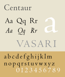
Centaur is a serif typeface by book and typeface designer Bruce Rogers, based on the Renaissance-period printing of Nicolas Jenson around 1470. It was given widespread release by the British branch of Monotype, paired with an italic designed by calligrapher Frederic Warde and based on the slightly later work of calligrapher and printer Ludovico Vicentino degli Arrighi. The italic has sometimes been named separately as the "Arrighi" italic.
Centaur is an elegant and quite slender design, lighter on the page than Jenson's work and most other revivals, an effect possibly amplified in the digital release compared to the metal type. It has been popular in fine book printing and is often used both for printing body text and especially titles and headings. One of its most notable uses has been in the designs of Penguin Books, who have regularly used it for titling.
Rogers' primary influence was Nicholas Jenson's 1470 Eusebius, considered the model for the modern upright printing of the Roman alphabet, which Rogers studied through enlarged photographs. Centaur also shows the influence of types cut by Francesco Griffo in 1495 for a small book titled De Aetna written by Pietro Bembo. The typeface is classified as belonging to the humanist style of old-style designs, based on the predominant influence of Jenson's work. The style is also called Venetian for the city Jenson worked in during his career as a printer. In the late nineteenth century, Jenson's work had become a popular model for William Morris and then other fine printers of the Arts and Crafts movement. Morris commissioned a revival font copying Jenson's work, and several other revivals and imitations of Morris' work had followed by 1914.
...
Wikipedia
