Palatino
 |
|
| Category | Serif |
|---|---|
| Classification | Old-style |
| Designer(s) | Hermann Zapf |
| Foundry | Linotype |
| Date released | 1948 |
| Variations | Palatino Nova Palatino Sans |
 |
|
| Category | Serif |
|---|---|
| Classification | Old style |
| Designer(s) | Hermann Zapf |
| Foundry | Linotype |
| Date created | 1954 |
| Trademark | Linotype |
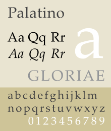
Palatino is the name of an old-style serif typeface designed by Hermann Zapf, initially released in 1948 by the Stempel foundry and later by other companies, most notably the Mergenthaler Linotype Company.
Named after 16th century Italian master of calligraphy Giambattista Palatino, Palatino is based on the humanist types of the Italian Renaissance, which mirror the letters formed by a broad nib pen; this gives a grace reflecting Zapf's expertise as a calligrapher. Its capital 'Y' is in the unusual 'palm Y' style, inspired by the Greek letter upsilon, a trait found in some of the earliest versions of the letter such as that of Aldus Manutius.
Unlike most Renaissance typeface revivals, which tend to have delicate proportions such as a low x-height (short lower-case letters and longer ascenders and descenders), Palatino has larger proportions, increasing legibility. Palatino was particularly intended as a design for trade or 'jobbing' use, such as headings, advertisements and display printing, and was created with a solid, wide structure and wide apertures that could appear clearly on poor-quality paper, when read at a distance or printed at small sizes.
It is one of several related typefaces by Zapf, each showing influence of Italian Renaissance letter forms, although Zapf was unable to visit Italy until after he had finished the Palatino roman. The group includes Palatino, Sistina, Michaelangelo Titling, and Aldus, which take inspiration from the Humanist forms of late 15th and early 16th Century Italy. Paul Shaw has described Michaelangelo, Sistina, Aldus and Kompakt, an ultra-bold display design from 1952, as "Palatino's extended family". However, Palatino rapidly became popular for book body text use, overshadowing the narrower and lighter Aldus, which Zapf had designed for this role. It has been cited as one of the ten most used serif typefaces. Since Palatino was not originally designed for body text, some of its characters were intended to stand out with quirky, calligraphic design features, and Zapf later redesigned them with more sober alternates, which have become the norm on most digital versions.
...
Wikipedia
