
Zapf Dingbats
 |
|
| Category | Dingbats |
|---|---|
| Designer(s) | Hermann Zapf |
| Foundry | ITC |
ITC Zapf Dingbats is one of the more common dingbat typefaces. It was designed by the typographer Hermann Zapf in 1978 and licensed by International Typeface Corporation.
In 1977, Zapf created about 1000 (or over 1200 according to Linotype) sketches of signs and symbols. ITC chose from those a subset of 360 symbols, ornaments and typographic elements based on the original designs, which became known as ITC Zapf Dingbats. The font first gained wide distribution when ITC Zapf Dingbats, which consists of the subset chosen by ITC, became one of 35 PostScript fonts built into Apple's LaserWriter Plus.
When ITC Zapf Dingbats was first announced in U&lc magazine volume 5-2, the family was divided into the 100 series (ITC-100), 200 series (ITC-200), 300 series (ITC-300). Each series contains 120 symbols.
It is an OpenType version of the font family, based on the PostScript variant of the font. The glyphs are mapped to the corresponding Unicode code points. The family consists of 1 font (ITC Zapf Dingbats Medium) with 204 glyphs.
The ITC glyph set is included in Unicode and it is one of the "Basic 14" typefaces guaranteed to be available for PDF files.
ZapfDingbats, PostScript version of ITC Zapf Dingbats, is distributed with Acrobat Reader 5 and 5.1.
Zapf Essentials is an update to the Zapf Dingbats family which consists of 6 symbol-encoded fonts categorized in Arrows One (black arrows), Arrows Two (white arrows, patterned arrows), Communication (pointing fingers, communication devices), Markers (squares, triangles, circles, ticks, hearts, crosses, check marks, leaves), Office (pen, clock, currency, scissors, hand), Ornaments (flowers, stars), for a total of 372 glyphs. However, not all ITC Zapf Dingbats glyphs are included in the Zapf Essentials collections (e.g.: airplane, letter).
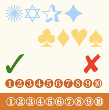
Examples of characters included in Unicode (ITC Zapf dingbats series 100 and others):
David Carson, radical editor of experimental music magazine Ray Gun, lent the font a degree of notoriety in 1994 when he printed an interview with Bryan Ferry in the magazine entirely in the symbols-only font – the double-page spread was of course, quite illegible and would have to be interpreted like a cryptogram for those unfamiliar with the font. He said he did it because the interview was "incredibly boring" and that upon searching his typeface collection for a suitable font and ending at Zapf Dingbats, decided to use it with hopes of making the article interesting again.
...
Wikipedia