University of California Old Style
 |
|
| Category | Serif |
|---|---|
| Classification | Old-style |
| Designer(s) | Frederic Goudy |
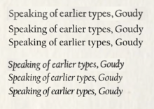
| Shown here | University of California Old Style metal type in regular and italic styles, compared to two digitisations: Californian FB and ITC Berkeley Old Style Medium. |
University of California Old Style is a serif font designed by Frederic Goudy and created for the University of California Press from 1936-8. It is one of Goudy's most popular serif fonts.
University of California is an 'old-style' serif font, one inspired by the styles of printing popular before the late eighteenth century. Goudy described it as particularly inspired by the 'Fell Types', a collection of 1670s fonts used by Oxford University Press, while other details such as the tilted cross-stroke of the 'e' recall what is now called the 'Venetian' style of typeface design, used by printers such as Nicolas Jenson up to the 1490s. Intended for fine book printing, the design has a delicate grace and strokes that alternate between thick and thin. Serifs are fine slabs with minimal bracketing. Goudy provided a set of swash capitals as alternates for the italic.
Like many of Goudy's other families, it has been rereleased and made generally available after his death, under a variety of (often shorter) names. While no longer the corporate font of the University of California Press, it retains a strong popularity in academia and is used as a corporate font by several universities.
Goudy used the font to set his book Typologia (1940) which was printed by the University of California Press in the new font, and he describes his inspiration for it in the chapter The Story of a Type. He described it as particularly intended to be intended to be attractive in mass and said that the italic was intended to be "a refined letter, yet not, I hope, one which may be called prudish…some letters are a bit exuberant. As an italic is [mostly used] to emphasise a word…or sometimes merely to give a lighter touch, I have allowed myself to incorporate here and there in my font some forms more or less fanciful." It was finished just before a fire that destroyed Goudy's workshop, engraving machine and plan drawings, and Goudy noted in his book that it was lucky that he had posted off finished work to Monotype to use as a basis for making punches for their hot metal typesetting system, allowing some letters to be redrawn from patterns.
...
Wikipedia
