Typographic unit
Typographic units are the units of measurement used in typography or typesetting. Traditional typometry units are different from familiar metric units because they were established in the early days of printing. Though most printing is digital now, the old terms and units have persisted.
Even though these units are all very small, across a line of print they add up quickly. Confusions such as resetting text originally in type of one unit in type of another will result in words moving from one line to the next, resulting in all sorts of typesetting errors (viz. rivers of white, widows and orphans, disrupted tables, and misplaced captions). Before the popularization of desktop publishing, type measurements were carried by using a tool called typometer.
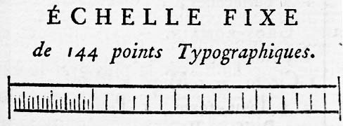
In Europe, the Didot point system was created by François-Ambroise Didot (1730–1804) in c. 1783. Didot's system was based on Pierre Simon Fournier's (1712–1768), but Didot modified Fournier's by adjusting the base unit precisely to a French Royal inch (pouce), as Fournier's unit was based on a less common foot.
(Fournier's printed scale of his point system, from Manuel Typographique, Barbou, Paris 1764, enlarged)
However, the basic idea of the point system – to generate different type sizes by multiplying a single minimum unit calculated by dividing a base measurement unit such as one French Royal inch – was not Didot's invention, but Fournier's. In Fournier's system, an approximate French Royal inch (pouce) is divided by 12 to calculate 1 ligne, which is then divided by 6 to get 1 point. Didot just made the base unit (one French Royal inch) identical to the standard value defined by the government.
In Didot's point system:
Both in Didot's and Fournier's systems, some point sizes have traditional names such as Cicero (before introduction of point systems, type sizes were called by names such as Cicero, Pica, Ruby, Long Primer, etc.).
...
Wikipedia

