Kabel (typeface)
 |
|
| Category | Sans-serif |
|---|---|
| Classification | Geometric |
| Designer(s) | Rudolf Koch |
| Foundry | Gebr. Klingspor |
| Variations | ITC Kabel |
Kabel is a sans-serif typeface designed by German designer Rudolf Koch, and released by the Klingspor foundry from 1927 onwards.
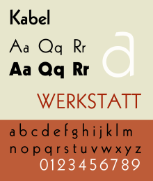
Kabel belongs to the "geometric" style of sans-serifs, which was becoming popular in Germany at the time of Kabel's creation. Based loosely on the structure of the circle and straight lines, it nonetheless applies a number of unusual design decisions, such as a delicately low x-height (although larger in the bold weight), a quirky tilted 'e' and irregularly angled terminals, to add delicacy and an irregularity suggesting stylish calligraphy, of which Koch was an expert. A variety of rereleases and digitisations have been created.
Like its contemporary Futura, Kabel bears influence of earlier “artistic” sans-serif typefaces; the 1919 Feder Schrift, drawn by Jakob Erbar, and more so his 1922 design called Erbar. Still, Kabel is as much Expressionist as it is Modernist, and may be considered as a sans serif version of his Koch-Antiqua, sharing many of its character shapes and proportions, most notably its low x-height and its two-storey 'g' with a large, partly open lower loop. Stroke weights are more varied than most geometric sans-serifs, and the terminus of vertical and horizontal strokes are cut to an angle. This gives Kabel the effect of not quite sitting on the baseline and making for a more animated, less static feeling than Futura. The capitals are broad and show influence of Roman square capitals. The capital 'W' has a four-terminal form and the 'G' has no terminal.
Koch marketed Kabel with a specimen showing the capitals supposedly derived from a construction grid of perfect rectangles and circles, but Walter Tracy and others have noted that this graphic does not really resemble the letters of the printed type, which were clearly drawn freely rather than by uncorrected geometry: "Koch probably drew [his] letters without constraint, and then 'rationalised' them afterwards…Koch was evidently not a man to be bound by arbitrary rules. In Kabel Light the arms of E are actually three different lengths, the bowl of R is deeper than that of B, and in P it is deeper still…and Y does not have the vertical stem shown in the diagram. In short, Koch's sense of style is in command, rather than any geometric formula. The result is an alphabet of capitals that relate perfectly without need [of] 'mathematical harmony'…they are, for my taste, the most attractive of all sans-serif capitals."
...
Wikipedia
