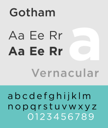
Gotham (typeface)
 |
|
| Category | Sans-serif |
|---|---|
| Classification | Geometric sans-serif |
| Designer(s) | Tobias Frere-Jones |
| Foundry | Hoefler & Co. |
| Date released | 2000 |
| Variations | Gotham Rounded, Gotham Condensed, Gotham Narrow, Gotham X-Narrow, Gotham Bold |
Gotham is a family of widely used geometric sans-serif digital typefaces designed by American type designer Tobias Frere-Jones in 2000. Gotham's letterforms are inspired by a form of architectural signage that achieved popularity in the mid-twentieth century, and are especially popular throughout New York City. Gotham has a relatively broad design with a reasonably high x-height and wide apertures.
Since creation, Gotham has been highly visible due to its appearance in many notable places, including a large amount of campaign material created for Barack Obama's 2008 presidential campaign, and the 2016 federal election campaign of the Australian Labor Party. The font has also been used as the cornerstone of the One World Trade Center, the tower built on the site of the former World Trade Center in New York. It is also the current font to be used in MPAA title cards for film trailers in the U.S.
Developed for professional use, Gotham is an extremely large family, featuring four widths, eight weights, and separate designs for screen display.
The Gotham typeface was initially commissioned by GQ magazine, whose editors wanted to display a sans-serif with a "geometric structure" that would look "masculine, new, and fresh" for their magazine. GQ agreed that they needed something "that was going to be very fresh and very established to have a sort of credible voice to it," according to Jonathan Hoefler.
Frere-Jones' inspiration for the typeface came from time spent walking block-by-block through Manhattan with a camera to find source material, and he based the font on the lettering seen in older buildings, especially the sign on the Eighth Avenue façade of the Port Authority Bus Terminal. "I suppose there's a hidden personal agenda in the design," Frere-Jones said, "to preserve those old pieces of New York that could be wiped out before they're appreciated. Having grown up here, I was always fond of the 'old' New York and its lettering."
...
Wikipedia
