Ehrhardt (typeface)
 |
|
| Category | Serif |
|---|---|
| Classification |
Old-style Dutch |
| Designer(s) | Nicholas Kis |
| Foundry | Monotype Corporation |
| Date released | 1938, 1680s |
| Design based on | Janson |
| Variations | Fleet Titling |
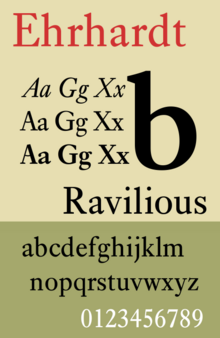
Ehrhardt is an old-style serif typeface released by British branch of the Monotype Corporation in 1938. Ehrhardt is a modern adaptation of printing types of "stout Dutch character" from the Dutch Baroque tradition sold by the Ehrhardt foundry in Leipzig. These are believed to have been cut by the Hungarian-Transylvanian priest and punchcutter Miklós (Nicholas) Tótfalusi Kis while in Amsterdam in the period from 1680 to 1689.
From 1937 to 1938, Monotype re-cut the type for modern-day usage, and it has become a popular book typeface. Ehrhardt has a slightly condensed design, giving it a strongly vertical, crisp appearance.
Miklós Kis, a Transylvanian Protestant priest and schoolteacher, became deeply interested in printing after being sent to Amsterdam to help print a Hungarian Protestant translation of the Bible. This was a period of considerable prosperity for the Netherlands and a time when its styles of printing were very influential across Europe, making it a centre for the creation of new typefaces. He developed a second career as a punchcutter, an engraver of the punches used as a master for making moulds for metal type, working on commission for printers and governments. Kis returned to Transylvania around 1689 and may have left matrices (the moulds used to cast type) in Leipzig on his way home. The Ehrhardt type foundry of Leipzig released a surviving specimen sheet of them around 1720.
Kis's typefaces were in the tradition of Dutch and German printing developed over the previous century that would later be called the "Dutch taste" (goût hollandois). This developed the influence of French typefounding such as the typefaces engraved by Claude Garamond with a smooth, even structure and 'e' with a level cross-stroke, by increasing the stroke width, boosting the x-height (height of lower-case letters) and reducing the length of the descenders to achieve a noticeably darker colour on the page.
...
Wikipedia
